[Lab] Codecademy CSS 教學筆記 5
--- CSS Positioning ---
1 / 25
See it to believe it
CSS box model


2 / 25
Taking up space
HTML elements 預設 width 全螢幕寬

position property display 有四個value :


3 / 25
Inline-block
Our
div預設是block,block特性是無論內容長度,預設寬度是全螢幕
inline-block 則是block仍為block,但寬度不再是全螢幕,block之間可以並排

4 / 25
Inline
inline讓element並排,但不維持使寸
The

None!

6 / 25
Sketching it out
Now that you understand more about the display property and the box model, we can delve into the details of how each individual box behaves.
 一個 box model 包含了 margin, border, padding, content
margin 是box與box之間的空間,可以用margin控制box們的擺放位置
border 是box的邊框(edge)
padding 是box內實際的內容與邊框之間的空間
content 是實際的內容
剩下的TM LM RM BM 分別代表top margin, left margin, right margin, button margin等,依此類推TB BB LB RB則是border的上下左右...
7 / 25
Margin
set its
margin: auto;

8 / 25
Margin top, right, bottom, left
可以逐一設定
也可以簡便寫成:

9 / 25
Borders

10 / 25
Padding
順序一樣順時針 上 右 下 左
如果到四個邊的距離都一樣的話,就不用給四次一樣的值,寫一次就OK了如下述
if you want your padding to be the same for all four sides, you can declare that value only once.

11 / 25
Negative values
使用負得值,可以把東西移動到相反的方向

12 / 25
Review

13 / 25
To the right!
使用關鍵字: float
語法 float:right;
 float 屬性有三個可能的值:left、right、和 none
14 / 25
To the left!
語法 float:left;
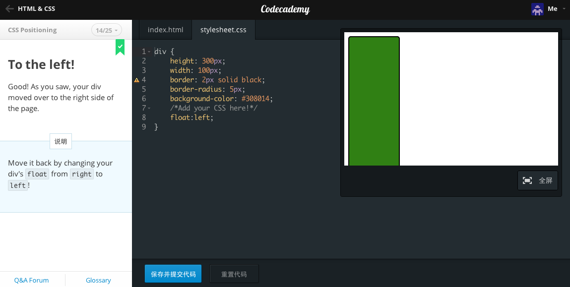
15 / 25
Float for two


16 / 25
Clearing elements
語法:
去除float的設定


尚未clear前
 把中間的藍色橫條 clear: left; 或是 clear:right;或是clear:both;
 就會跑到下面去啦!
因為中間的左右兩塊分別有float:left; 跟 float:right;
所以中間那塊要

17 / 25
Static by default
element的positioning type預設是為靜止的static


18 / 25
Absolute positioning
When an element is set to
19 / 25
Relative positioning

20 / 25
Fixed positioning
 可讓東西黏住在螢幕上,無論怎麼捲動都還是黏在那個位置上!
21 / 25
The story so far
 display有:block, inline-block, inline 跟 none
margin border padding
position absolute fixed static float 等
22 / 25
Navigation bar, where are you?

23 / 25
Displaying it properly


24 / 25
Floating right along


25 / 25
You've done it!
1 / 25
See it to believe it
CSS box model
2 / 25
Taking up space
HTML elements 預設 width 全螢幕寬
position property display 有四個value :
block: This makes the element a block box. It won't let anything sit next to it on the page! It takes up the full width.
inline-block: This makes the element a block box, but will allow other elements to sit next to it on the same line.
inline: This makes the element sit on the same line as another element, but without formatting it like a block. It only takes up as much width as it needs (not the whole line).
none: This makes the element and its content disappear from the page entirely!
3 / 25
Inline-block
Our
<div>s wereblock elements by default;div預設是block,block特性是無論內容長度,預設寬度是全螢幕
inline-block 則是block仍為block,但寬度不再是全螢幕,block之間可以並排
4 / 25
Inline
inline讓element並排,但不維持使寸
The
inline value places all your elements next to one another, but not as blocks: they don't keep their dimensions.
"The good news is,
inline places all your elements on a single line. The bad news is that it doesn't maintain their "box"ness: as you saw, all your <div>s got squished to the smallest possible width!
The
5 / 25inline display value is better suited for HTML elements that are blocks by default, such as headers and paragraphs." -- from codecademyNone!
6 / 25
Sketching it out
Now that you understand more about the display property and the box model, we can delve into the details of how each individual box behaves.
margin 是box與box之間的空間,可以用margin控制box們的擺放位置
border 是box的邊框(edge)
padding 是box內實際的內容與邊框之間的空間
content 是實際的內容
剩下的TM LM RM BM 分別代表top margin, left margin, right margin, button margin等,依此類推TB BB LB RB則是border的上下左右...
7 / 25
Margin
set its
margin to auto, this tells the document to automatically put equal left and right margins on our element, centering it on the page.margin: auto;
8 / 25
Margin top, right, bottom, left
margin-top: /*some value*/
margin-right: /*some value*/
margin-bottom: /*some value*/
margin-left: /*some-value*/也可以簡便寫成:
margin: 1px 2px 3px 4px;9 / 25
Borders
10 / 25
Padding
padding-top: /*some value*/
padding-right: /*some value*/
padding-bottom: /*some value*/
padding-left: /*some-value*/順序一樣順時針 上 右 下 左
padding: value value value value;如果到四個邊的距離都一樣的話,就不用給四次一樣的值,寫一次就OK了如下述
if you want your padding to be the same for all four sides, you can declare that value only once.
padding: 10px will give your HTML element 10 pixels of padding on all sides.11 / 25
Negative values
使用負得值,可以把東西移動到相反的方向
12 / 25
Review
13 / 25
To the right!
使用關鍵字: float
語法 float:right;
14 / 25
To the left!
語法 float:left;
15 / 25
Float for two
16 / 25
Clearing elements
語法:
element {
    clear: /*right, left, or both*/
}去除float的設定
尚未clear前
因為中間的左右兩塊分別有float:left; 跟 float:right;
所以中間那塊要
clear the other elements on the page!17 / 25
Static by default
element的positioning type預設是為靜止的static
18 / 25
Absolute positioning
When an element is set to
position: absolute, it's then positioned in relation to the first parent element it has that doesn't haveposition: static. If there's no such element, the element withposition: absolute gets positioned relative to <html>. -- from codecademy |
| 這裡的outer有設定position:absolute; 所以inner也設成position:absolute;且margin-left:20px時 會依著outer的邊緣移動20px |
Relative positioning
20 / 25
Fixed positioning
21 / 25
The story so far
margin border padding
position absolute fixed static float 等
22 / 25
Navigation bar, where are you?
23 / 25
Displaying it properly
24 / 25
Floating right along
25 / 25
You've done it!


留言
張貼留言